Landing page best practices show that these pages are standalone web pages designed to capture a visitor’s information through a lead-capture form. Unlike a homepage, which serves many purposes, a landing page is focused on a single goal, often tied to a marketing campaign.
Whether you’re offering an ebook, a free trial, or a special discount, landing pages are designed to guide visitors toward a specific action. The primary reason landing pages are so effective is their focus because by eliminating distractions and guiding the visitor toward a single call-to-action (CTA), you increase the likelihood of conversion.
A landing page with a single objective ensures that every element on the page supports the main goal. This design choice helps visitors understand what you want them to do without confusion.
What are the key elements of a successful landing page?
A concise and engaging headline
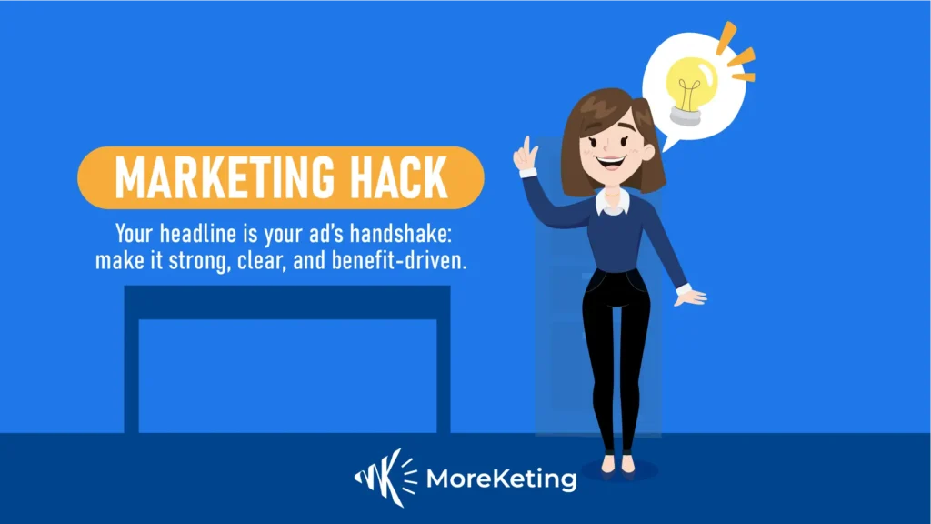
Your headline is the first impression visitors get when arriving to your page. It has to grab attention and communicate your offer’s value concisely. For example, rather than saying “Check Out Our Products,” you might say “Upgrade Your Summer Style with 20% Off Trendy Swimwear Today”. This headline is straightforward, benefit-oriented, and lets visitors know what they can get out of it.
The headline of your copy should correspond to what visitor expected when they clicked the ad/link. If your ad copy promised “Free eBook: 10 Tips for a Healthier Pool,” the headline on the landing page should reflect that promise: “Download Your 10 Tips to Keep Your Pool Sparkling, Here!”.
A mismatch, such as “Explore Our Pool Accessories,” could be confusing for visitors and up your bounce rate.
High-quality visuals
Upload the most relevant quality images or videos to accompany your offer and further illustrate the way it will benefit the viewer. Here are some best practices:
- Choose images that reinforce your message and appeal to your audience. Pictures should not only be fancy but also must own meaning.
- If appropriate, use video to clarify the offer or show the product. Videos can boost engagement and conversions by bringing a dynamic element to the presentation of information.
Visitors can be easily confused by extraneous elements, so simplicity is paramount. Maintain a clean design so visitors can move around the page clearly and know what your offer is.
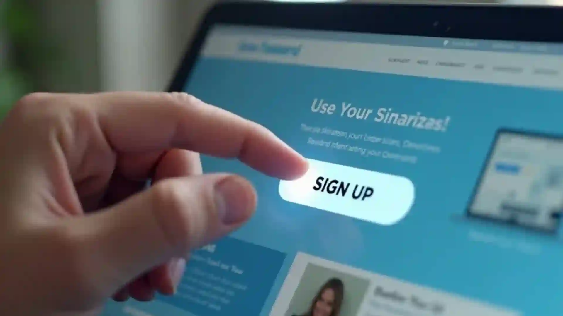
A strong call to action
The CTA is where your landing page shines. It’s that one thing you want the people who visit your site to do, whether that’s downloading a resource, signing up for a webinar, or making a purchase.
To optimize your CTA:
- Choose a single action that should be your focus, so that they are not left to guess at which of your actions will be more beneficial to them.
- The less there is to choose from, the less our brain must think, and the more easily the visitor is directed to do as you wish.
- Use direct-action words like “Download Now” or “Get Started” to clarify your CTA.
Place your CTA on the page with intention, it should be reachable without scrolling, and present at other lengthy pages for comfort. Strategic positioning means that the CTA will get attention at the right time and improve the conversion action.
Social proof
Social proof is an effective means of establishing trust and credibility. You can reassure visitors of the worth of your offer by displaying testimonials, reviews, or user-generated content. Consider including:
- Positive testimonials from happy clients to help establish trust.
- Share case studies
- Share sucess stories
- Show logos of recognized clients or certifications to add credibility. Trust badges are visual indicators that you can use to indicate safety and confidence.
Mobile-Friendly Design
Ensure your landing page works seamlessly on mobile devices. Use responsive layouts that adapt to different screen sizes. Make forms and CTAs easy to interact with on smaller screens to capture leads effectively.
High-converting landing pages examples

Landing pages are never done. Performance often can be improved significantly with frequent testing and optimization, using A/B testing to test various elements, such as headlines, images, and CTAs, can lead you to really understand your audience.
These variations were tested by Durafy, a Charlotte-based concrete contractor using landing pages as part of their marketing strategy, and within just 2 months, one version generated 24 real leads, proving that even small changes can make a big difference.
Key areas to test include:
- Headlines: You can experiment with semantic variations or even with different type of headlines to see which resonates with your audience best.
- Pictures and Videos: Try different types of visuals to see what people like viewing the most.
- Forms: Experiment with various form lengths or fields to find the sweet spot between information gathering and user-friendly. Shorter forms with minimum required information (name, email, phone) tend to have a higher conversion rate than longer, more detailed forms.
- Analytics: Use tools to track metrics such as conversion rates, bounce rates, and time spent on page. This data informs your optimization efforts and helps you make data-driven decisions.
For example, if you observe that visitors leave a page after 10 seconds, you might want to consider to optimize the headline or the hero image. By constantly testing and refining, as the case of Durafy who brought in dozens of leads within 3 months, you can get your landing page, to not just look good, but to deliver tangible results.
Remember, the key is to stay focused on your conversion goal and ensure every element of your page aligns with that objective.